The intuitive mind is a sacred gift and the rational mind is a faithful servant. We have created a society that honours the servant and has forgotten the gift. Albert Einstein
Last year, Adobe added a new tool to Lightroom that allows photographers to edit photos for HDR displays. It will enable you to access the full colour range in RAW files. The video below is an excellent explanation of how to use this new tool.
The two images below were captured with an X100V1 camera; the first was processed using this new tool, and the second is the same image with the HDR button turned off. The difference between the two is that the HDR setting lets you extract up to four additional stops of highlight detail from the original RAW file. To my eye, it creates a much cleaner look with greater colour variation.
DxO Labs, a French software company, was a site I used to go when buying camera equipment to review their lens and camera test results. At the time, I was unaware that they were also producing software to correct issues in digital cameras and lenses. The testing division in 2017 was spun off as a separate company called DXOMARK. I suspect that much of that testing information was used to develop several DxO Lab software products. Today, those products are entering the mainstream in the photoprocessing industry.
In 2004, they released DxO Optics Pro, digital editing software, and then in 2012 they acquired the Nik Collection from Google. Software that had initially been developed in concert with Nikon. Then, in 2018, they re-released the Nik Collection as a DxO product; in 2021, they released Dx Pure RAW. To make a long story short, today they have the following products DxO PhotoLab photo editing software ; DxO FilmPack film emulation software; DxO ViewPoint distortion and perspective correction software; DxO PureRAW RAW development software with groundbreaking noise reduction and detail recovery; and Nik Collection now in version 8.2.
Today, several well-known photographers suggest that the DxO family of software can outperform Adobe’s Lightroom and Photoshop, which have long dominated the market. It has been suggested that Adobe accounts for about 58% of the market, while DxO likely accounts for around 2%. One has to wonder whether or not Adobe’s much-hated subscription model will survive one more non-subscription product.
One of the more popular YouTube photography channel broadcasters, Tony Northrup, a year ago began suggesting that it is a professional alternative to Adobe products. In his latest podcasts reviewing the new versions of DxO products, he is now suggesting it processes RAW files better than Lightroom.
This year, Andy Hutchinson, another somewhat irreverent YouTube broadcaster, suggested that the three high-end commercial photography editing programs are Lightroom, Capture One and DxO. He further indicates that DxO now offers the best demosaicing, denoising, lens correction, and masking. Others echo similar perspectives, including Todd Dominey.
Fstoppers is another well-known YouTube channel, suggesting that DxO products can hold their own against Adobe products.
Testing DxO Pure RAW 4
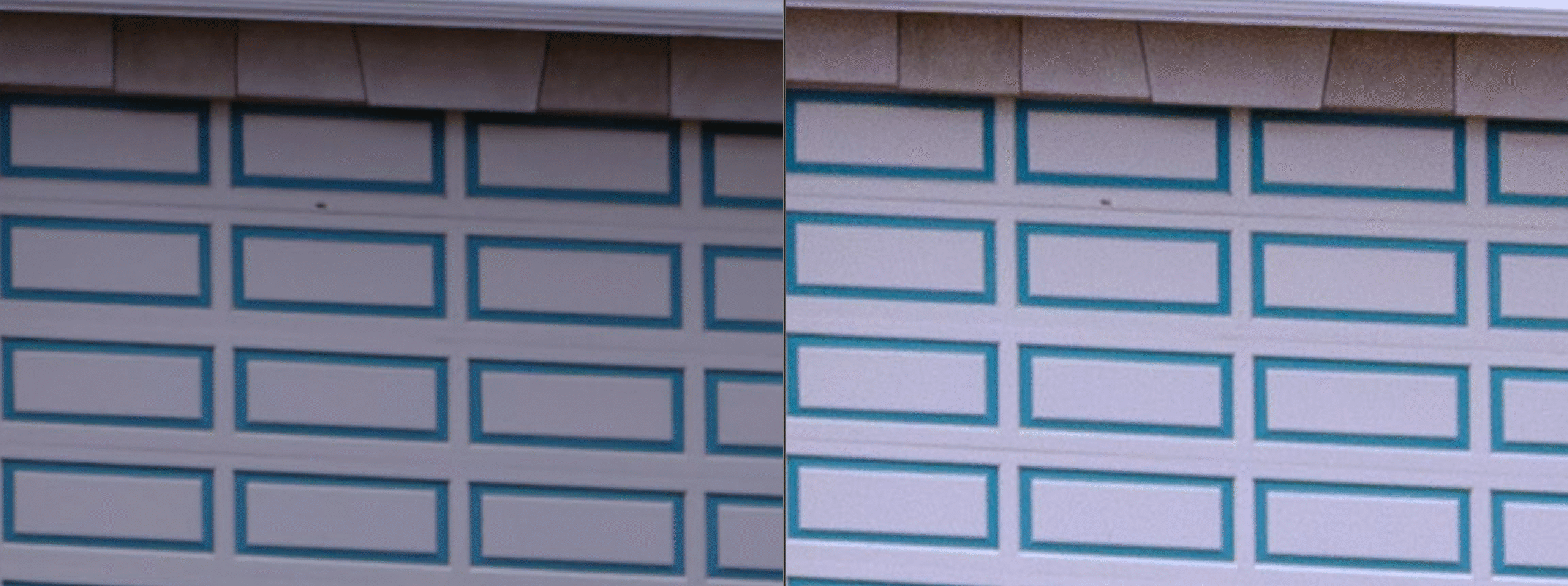
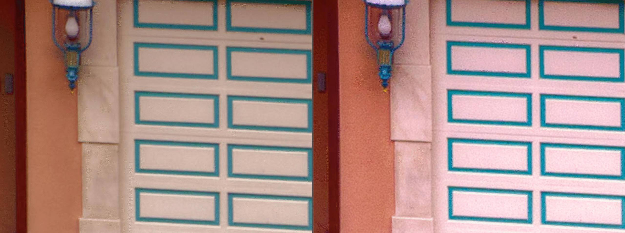
The image below was taken with a medium-format 100 MP camera at 500 ISO, 1/30, f/10. The image on the left is the RAW file in Lightroom; the image on the right has been processed in DxO. This section of the image is shown at 400%.
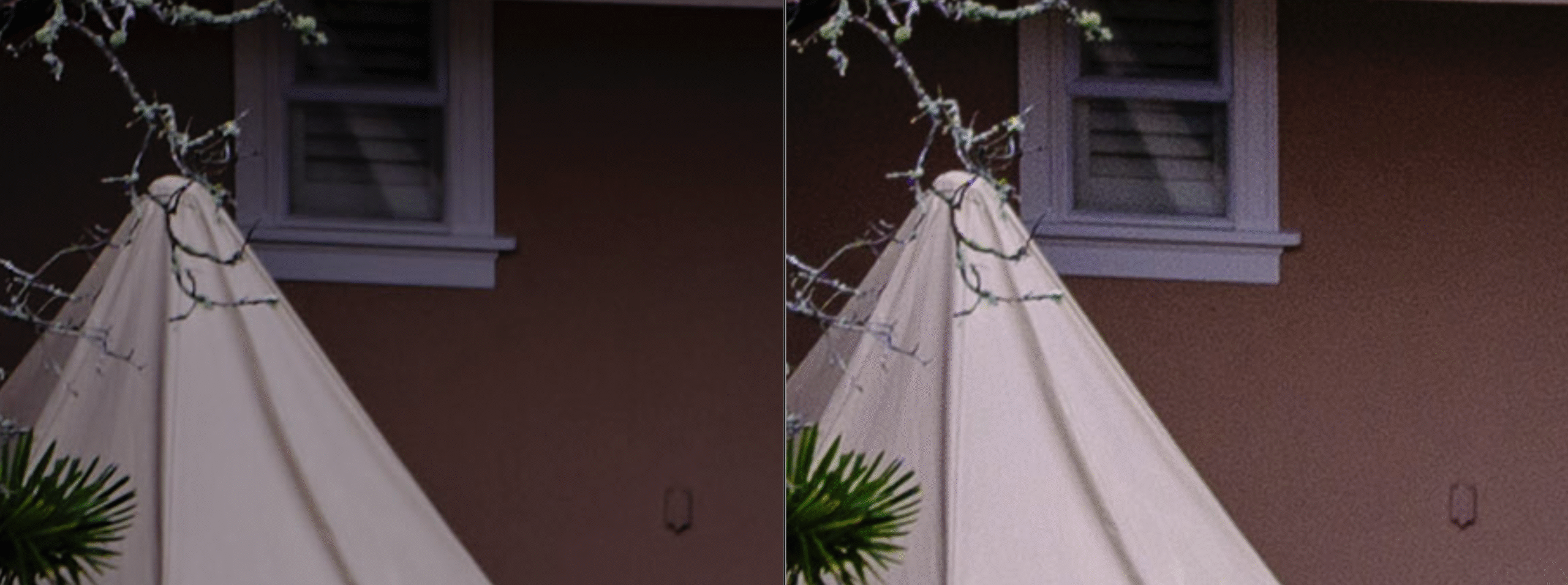
This is the same comparison, except that the Lightroom image on the left has undergone AI denoising in Lightroom.
Finally, the two images have undergone identical adjustments in Lightroom. It is striking that there would be such a difference in colour, contrast, sharpness, and resolution. Again, Lightroom on the left and DxO on the right.
Keep in mind, I did not use the more comprehensive DxO RAW plug-in. The image below shows the interface for manual adjustments. The Lens softness compensation offers four options, and the image crop provides three.
Finally, here is a comparison between the DxO file on the right and a RAW image processed in Capture One on the left, with the same Lightroom adjustments applied to both images.
Affinity has been a great subscription-free alternative for designers and book makers who struggle to afford Adobe’s expensive subscription service. Having been acquired by Canva, it is now not only advertised as “free forever,” but it has also undergone significant enhancements. You can see the upgrades and a discussion of their relationship with Canva in the video below. One interesting note is that the three programs are now combined into one application. Inside the application, there are three options labelled Vector, Raster, and Layout.
So whenever something that costs a considerable amount of money to produce, one has to ask how is this sustainable? A lot of scenarios come to mind:
Offer the basic software, similar to what you find in Photoshop Elements, and reserve the advanced features for a subscription model.
Will you become the product? They may choose to skim the creative output to enhance their AI engines.
Canva may absorb the engineering expertise present in Affinity, then sell the company, like how Google acquired NIC, absorbed the expertise into its products, and subsequently sold NIC to DXO.
However, Canva is not Google; they are in direct competition with Adobe, but have a much more accessible platform, making it cheaper for corporations to produce materials with less skilled workers. What they lacked was the more professional software that Affinity provides. Currently, Adobe holds a market share of between 69% and 70%, compared to Canva’s 10%. I am guessing Affinity might be around 10-12% of the market. So by purchasing Affinity, Canva has increased its market share.
In addition to increasing their market share, they are now creating a system that may allow for the initial work to be done in a simplified manner and then refined in Affinity, much like how Lightroom simplified many Photoshop tools, enabling us to complete most of our work in Lightroom before refining it in Photoshop. As Canva offers a wide range of prepackaged designs, this may allow less skilled workers to initiate projects in Canva and then complete them in Affinity with the assistance of experts, thereby reducing costs for both large and small companies.
Canva has also acquired Flourish, Serif, SmartMockups, Pexels, Pixabay, and SlidesCarnaval, thereby expanding its systems. They have implied that purchasing Canva will provide you with more capabilities in Affinity. Does this mean throttling features in Affinity? So far, all that they have said is that the AI capacity resident in Canva only flows to Affinity with a Canva subscription. So, at face value, all the new Affinity upgrades will not lose features.
Their strategy might be to keep the product free and see if it draws people away from Adobe into the Canva world, growing their market share. This would mean keeping Canva free would be in their best interest. If so, it may have a long life; if not, they may sell it or integrate it into Canva.
It is essential, from time to time, to test your software processing tools against each other to examine how well they interpret RAW files from different camera systems. After all, every camera manufacturer uses different RAW formats and processing systems that interpret sensor information through various algorithms; similarly, every processing software has its own way of interpreting RAW files. In addition, cameras produce images at different resolutions with different pixel pitches. All of these issues can affect image quality and the extent to which one can adjust RAW files before they degrade to a point where the quality is unacceptable.
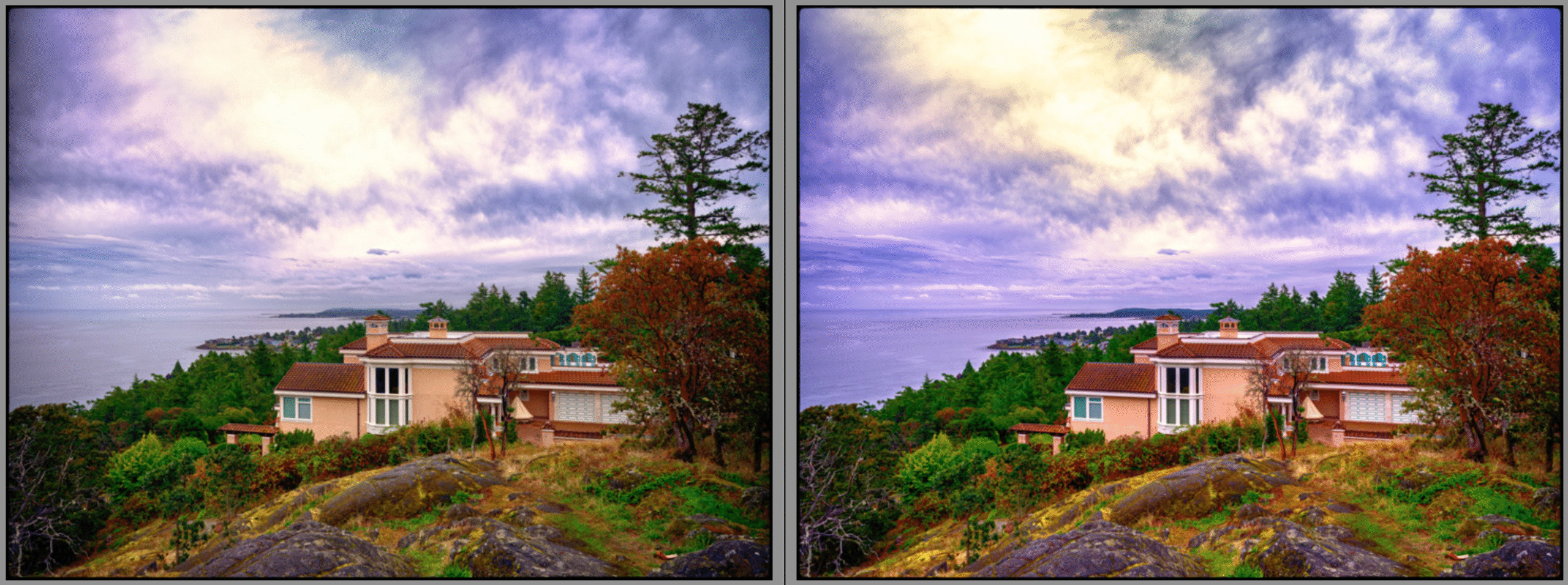
To compare what might happen to images from either Capture One or Lightroom when heavily processed, I initially processed both using each application’s default auto-process setting. The results of this process show a quite different approach: Capture One seems to be more concerned with preserving the highlights and therefore favours a darker exposure.
Looking at the two images at 600 percent, it appears the Lightroom file on the right shows more artifacts on the clean white surfaces—this is much more apparent in the darker areas of the image.
The two images were then processed in two Nik Applications using the same two customized presets. The intent here is to push the two images, which now have the RAW processing algorithms from each application, into a single TIFF file to see if there is a difference in how they hold together.
The following are the close-ups of the two images that were run through the NIK applications.
If you are capturing your images on your camera or phone in RAW, you may find that these files are flat or lack the pop that you get with a JPG. This is the nature of RAW files; they, unlike JPGs, contain all the information the camera has captured, giving you the capacity to make your own JPG, rather than relying on the JPG algorithm to decide for you. There are numerous applications for your computer, and even more for your phone, that can process RAW files. Fortunately, most have the same basic adjustments, so once you understand these adjustments, you should be able to understand the interface of most of these applications.
Most Popular Computer Applications
The first two rows of the chart below list the most widely used and most comprehensive applications.
Most Popular Phone Applications
In the list below, you will see that some computer applications have also been modified for use on phones. These are usually included with the computer application payment.
Computer Applications
Name
Key Features / Notes
Platform(s)
Adobe Photoshop
Industry standard: raster editing, compositing, layers, masking, lots of plugins & extensions.
I was struck by how different the processing tools in Lightroom are from those of just a few years ago. This got me curious so I went back in my archive to 2017 and picked a photograph that I had process at that time only using Lightroom. I then, as you can see ran the same image through a 2024 version of Lightroom. As you can see with the added enhancements in Lightroom I can now create a better image in Lightroom with out having to resort to Photoshop.
The parameter I set for processing the 2024 version was to use only Lightroom’s basic adjustments, such as sky mask or auto-transform. Just for fun, I further processed the image in NIK, sticking to basic plug-in presets. In this process, I learned that a novice Lightroom user is likely to make significantly better photographs in Lightroom in 2024 than in 2017. I would also suggest that most expert photographs might also have the same outcome and better images.
The first image is out of the camera and processed using Lightroom in 2017.
This second image shows the image process using Lightroom 2024, which contains more tools than the older version. One key difference is the masking function that has been added to Lightroom, although in 2017, many tools that have since been added to Lightroom are also found in Photoshop.
The following image has been moved through several NIK applications and back into Lightroom.
A Second Image from the Same Day
Lightroom Adjustments
Then, it was processed in Photoshop layers with NIK Viveza
Sean Tucker never uses auto-white balance. Instead, he sets it to daylight at 5500 Kelvin and leaves it there. The video below explains his reasoning for making sure his starting point illustrates a more accurate representation of the colour of the light at the time the image was taken.
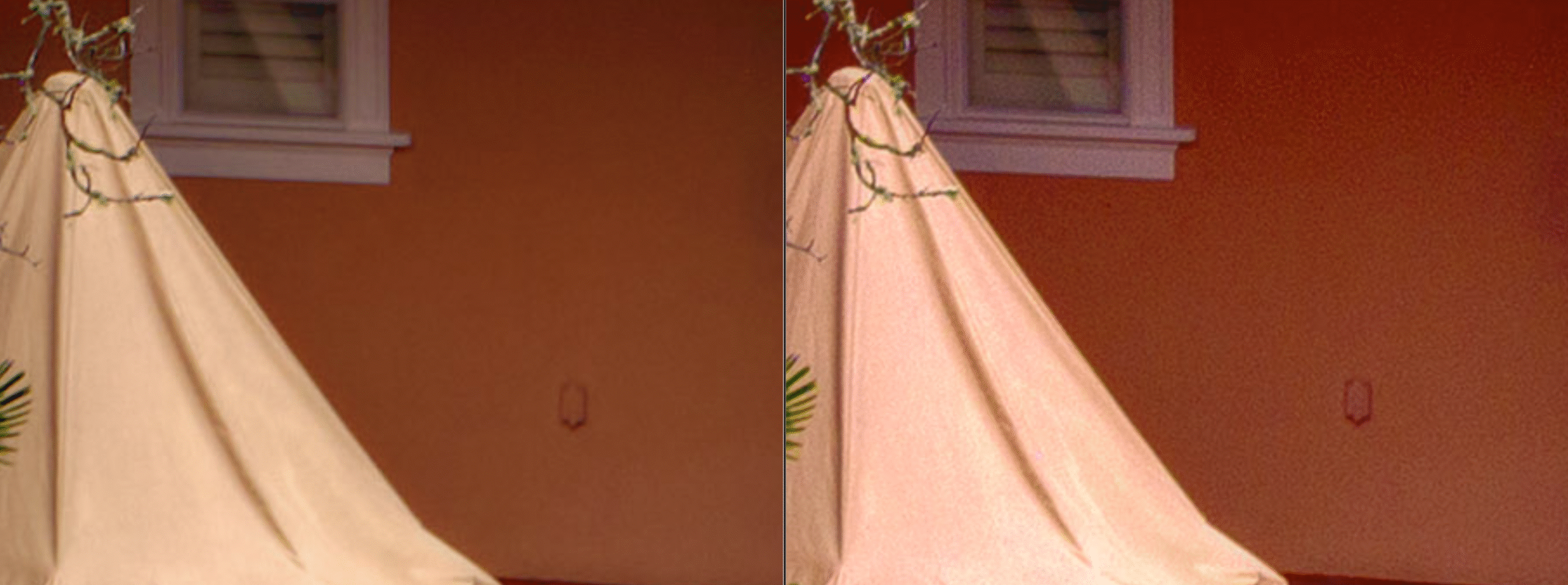
On a recent trip to New York, I did a lot of street photography, some done in the evening. As much of the subject matter was moving, the camera was handheld, so a very high ISO was used during the evening. I could have placed the camera on a tripod and approached the following example quite differently, but making images late at night handheld, I was not carrying a tripod. Also, setting up a tripod at night in the street is awkward and perhaps draws too much attention to one’s equipment. However, this led me to a very interesting way to process such images. (If you are interested in night photography techniques, both on and off the tripod, you could refer to my article titled Low Light Challenge.)
After spending some time in post-processing trying to decide how to work with the noise created by such high ISOs, I discovered a fairly straightforward way to create very painterly-looking images. Examples of these images are in the following gallery: Streets of New York. The first twenty or so images will give you a good idea of the end product of this process; the image below is included in this gallery. What follows is a step-by-step illustration of the process
I used the following eight images to create a panorama image. This was necessary as I was using a 35mm equivalent lens and did not have the ability to change to a wide-angle lens. I would also argue that often, in these situations, a panorama image is less distorted than having to use an ultrawide lens. If you are interested in the process of creating panoramic photographs, I cover this topic in another article: click here to go to that article.
RAW Images as they appear after downloading
The images were then all selected and run through Lightroom noise reduction AI software, which DNG files. In order to see the difference between the original RAW image and the AI noise reduction I have enlarged the centre of the image and increased the exposure by 3.5 stops. This shows a dramatic difference.
The image on the left is the DNG file produced by the AI noise reduction feature in Lightroom. The one on the right is the original RAW image.
I then selected the Lightroom tool Merge to Panorama, chose the Spherical option, and used the auto-toning button in Lightroom so I could see the building a bit better.
You can see that the Auto button made the following adjustments to the image. There is a significant, almost two-stop increase in exposure, a significant reduction to the highlights, a smaller adjustment to the shadows, and minor adjustments to the Whites and Blacks, but quite a bit of Clarity. The remaining adjustments were quite slight
I then decided to crop the image and make some further adjustments. Rather than try and increase the exposure I chose to use the Shadow and White tone sliders to increase the light on the building. At this point you can see the impact of the AI noise reduction by comparing the image below and the following one.
The following images are from panorama merge without using the AI noise reduction program. The second image has similar adjustments made to those used in the image above. Again you will want to click the images above and below to see the difference in the detail.
At this point, the blacks in the sky were problematic, so I used the masking feature to select the sky and made the adjustments illustrated below. These adjustments were only made to the area above the building, and there was a diffusion adjustment where the sky meets the building.
I then inverted the mask and made the following adjustments to the building while not altering the sky.
At this point, I used Lightroom to move the image into Photoshop, the Nik Collection plug is integrated into my Photoshop program. I then selected the Nik 7 Viveza program, a colour and toning tool. Using this program, I made some minor adjustments to the image.
Once the adjustments were made, I applied the changes, and the adjusted image came back to Photoshop as a new layer. I then selected the Nik 7 Colour Efex program to process the image further. In the tool I used the Detail Extractor, Tonal Contrast, and Midnight to modify the image. The intent is to move toward a more painterly look to the image and tone down the intensity of the colours and light.
At this point, the image is then saved in Photoshop, which automatically returns the new version of the image into Lightroom as a TIF; as I did not flatten this image, it retained the various layers that were created in Photoshop using the Nik programs. This means if I am not happy with some of the adjustments, I can use opacity settings or other adjustments to tweak the image.
Equipment Used
The following images were created on an X100 VI in April of 2024 at 10 pm. They are hand-held images at 1/125 and f4 at 12,800 ISO. For those unfamiliar with the camera it is a fixed lens camera with 23mm (APSC) lens, so in 35 mm terms this is a 35mm lens. The resolution of the camera is 40 megapixels. If you are interested in more information about this camera; click here to go to the article.
For some time, Capture One has had very subtle and comprehensive masking and a style system that allows you to memorize various adjustments that can be compounded. To catch up, Adobe has rushed to update Lightroom with more masking options and the introduction of intersecting masks. Although accessing this feature is somewhat convoluted, the power of intersecting masks is a significant upgrade. The following collection of videos outlines how these work and why you might be using this feature on every photograph you process.
Nigel Danson illustrates how intersecting masks can solve processing issues that previously were very complex to achieve.
Preparing an image for a book is not quite the same as printing your image. With a book, the viewing distance is set to a standard; therefore, there is a more rigorous standard around resolution. If you are working with a book designer, you likely will be guided by their advice, and this article may only provide insight into why certain things are required.
Often, requests to provide an image for a publication will fail to specify the format and will ask for a specific size and resolution but not provide you with directions on how to create a file to that specification. If you are asked to provide images for a publication and are given these instructions, then the following may interest you. Hopefully, they will help you put your best foot forward.
If They Don’t Specify a Size
Modern smartphones that create 12mp images produce a high-quality image, and the original jpg file can be in a book where the print area does not exceed 16 inches. So, in most cases, sending your smartphone’s original uncropped JPG photograph to an online book publishing site should be sufficient. This should also hold for almost all modern cameras, as most modern cameras produce files double the size of an iPhone. In these cases, the publishing site will adjust the image as the see fit for their publication.
What if you are asked for a specific size
Sometimes, websites ask you for a specific length and pixels per inch PPI or dots per inch DPI. DPI refers to the number of dots per inch that appear on paper when the image is printed. PPI refers to the number of screen pixels per inch when viewed on a monitor. Often, they will ask for a specific width and height in pixels
Adjusting Resolution and then size in Apple’s free Preview program
If someone is laying out a book for you, a RAW file may be more desirable, so it is good to check. Keep in mind RAW here is being used as a generic term; each camera will have a different RAW format: ARW (Sony), NEF (Nikon), CRW (Canon), RAF (Fujifilm), ORF (Olympus), RAW (Leica), etc. RAW files have the advantage of containing significantly more information than a JPG file; this allows a book designer to correct camera errors and bring more uniformity to the publication.
If you export the image from a processing program, you may have the following options: JPG, TIFF, PNG, DNG and PSD.
File Type
Compression
Pros
Cons
Use for
JPEG
Lossy
Widely supported small size
Loss of quality after multiple saves
high quality pictures, and web images
GIF
Lossless
Small size
Limited colour support
Primarily used for web images
PNG
Lossless
Small size
larger file size, not widely supported
Icons, logos transparent images, web images
TIFF
Lossless
Large File, high quality
Can quickly become a very large file
Used widely in printing
PSD
Lossless
Large file
Large files may need to be converted for some uses
Used by graphic designers
Lossy Compression can be problematic if the file has been saved multiple times, as each time it is saved it degrades in quality.
Camera errors can include mixed lighting problems, discolouring walls that should be white, objects that should be out of frame in a frame and angular distortions. Most of these are more easily corrected using a RAW file, and some of these are very difficult and sometimes impossible to correct using a JPG file. Focus issues due to the focus point not being set on the subject or setting your speed so slow the camera registers you hand movement, which both result in blurred image can not be fixed.
Resolution Coming from a Camera
The camera you use to create the image will determine the image resolution; for example, a 24mp camera will usually be 6000 X 4000 pixels, keeping in mind the file size, which may be 30MB or 48MB, does not tell you the resolution. The RAW image might be 30MB but converted to a TIFF; it could be 137MB or, as a JPG, 14MB, and all three could have the same resolution.
Two key elements that determine the resolution are DPI (dots per inch) or pixels per inch. In the image below, you can see a typical 24MP image from a camera. It produces a photo with a resolution of 240 pixels per inch and 25 inches on its longest side. Any resolution between 240dpi and 300dpi provides good print quality.
Typically, for book publishing, one would want to make sure the resolution was between 240 and 300 dpi and perhaps one or two inches more than the widest dimension of the book. This may not be technically necessary, but a little “fudge” room is always good. So, if the longest side of the book is ten by ten, I would not want the image to be less than 10 inches and not less than 240 dpi.
This shows a typical image in PixelsThis is the same image with the same pixels shown in inches.
Why Printing and Image for Wall Display is Different
Printing images for display on a wall involves taking into account the “circle of confusion,” which calculates the ability of an image to appear sharp, given the distance from which the viewer sees the image. I have left some links below if you want to read up on this, but I will not go into it in this article, only to say lower resolution images can appear sharp when enlarged and viewed from a distance. After all, the view distance of a work on a gallery wall often varies from that of a book. In today’s world of printing large images, individuals often step forward to look at the details of a print, so in these cases, the circle of confusion is misleading. I am not convinced that applying this theory to art photography is in the artist’s best interest. It likely works best when printing eight by ten images.
Resolution Coming from a Cell Phone
Typically, cell phones these days are 12MP. If you spend more money, the resolution can be much higher. The first image below is the size of a 12MP image from a typical smartphone. You will notice that although the image seems to be 42 inches on the longest side, the resolution is only 72 pixels per inch. Seventy-two pixels per inch is excellent for viewing on a computer screen but not for a book, as the resolution needs 300 dpi to appear sharp. Converting this file to 300 dpi means its size shrinks from 42 inches to 13.44 inches on the longest edge. This seems to be a good resolution for most books.
Resizing and Cropping
Resizing and cropping both affect the quality of the image. Cropping reduces the size of an image, so if you have cropped your image to get rid of unwanted material, you have reduced the resolution. If this is the case or you are using a cell phone image, you might consider increasing the image size by resizing. This process basically uses an algorithm to produce more pixels based on pixels in the original image. Generally speaking, although the image’s resolution has been increased, the quality is not necessarily better. In many cases, it has just become fuzzier. Sometimes this method is necessary as a last resort, but an expert best does it to minimize the loss of quality. I have included references on the processing of resizing below.
Colour Space, Computer Screens and Paper
Colour space will often come up if you are working with a book designer; in this case, they will guide you through this issue. Printing uses CMYK (Cyan, Magenta, Yellow and Black) colour space, but the internet and cameras use RGB (Red, Green and Blue), to create the colours in your image. I don’t recommend that those unfamiliar with this issue attempt to convert files for printing, and conversion is unnecessary for more informal image requests. The takeaway here is the conversion process could change, to some degree, the colour and tone of your image. Also, a backlit computer screen will display colours and tones very differently from a sheet of paper. So, colour and tone must be adjusted to fit the medium through which it is presented.